10 natural product redesigns (that rock!)10 natural product redesigns (that rock!)
Go ahead, judge a book by its cover. Or more accurately, a food by its package. These top natural food rebrands show the difference packaging can make.

If you think packaging doesn’t matter, think again. Particularly in natural food and beverage products, package design helps communicate to shoppers that a product contains wholesome, clean ingredients—or doesn't.
The good news: No longer must natural companies use muted tan colors with green accents to show their naturalness. The newest crop of rebrandings employ splashy and bright complementary colors (i.e. turquoise and green; orange and yellow) and clean, personal designs to woo consumers into buying products for the first time.
These recent redesigns represent some of the best food and beverage updates. Slide the dial (positioned in the middle of each picture) to view each product’s packaging before and after redesigning.
Core Foods
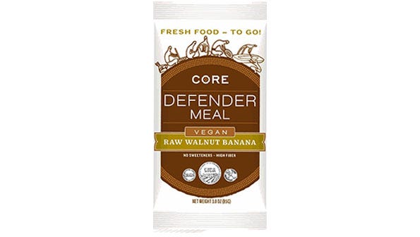
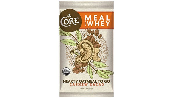
A hand-drawn package depicts the main ingredients in these whole-food meal replacement bars, giving Core Foods a bountiful, nutrient-dense feel.
Greater Than Sports Drink
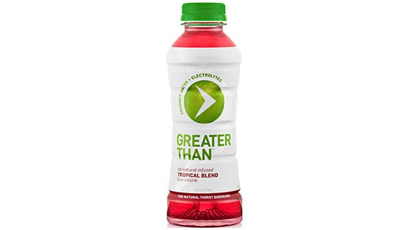
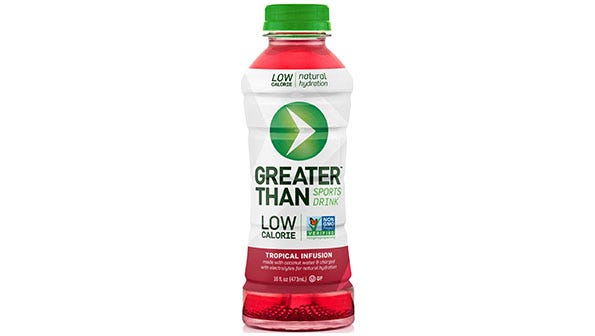
The addition of a prominently placed Non-GMO Project verification and a flavor name adjustment (“Tropical Blend” was changed to “Tropical Infusion”), this coconut water-based sports drink can better attract athletes who wish to choose natural beverages.
Wild Ophelia
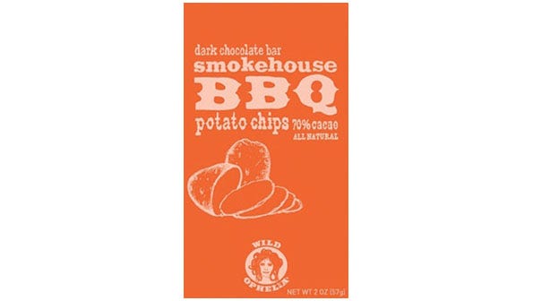
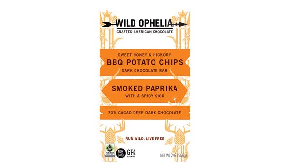
We love Wild Ophelia’s Western-inspired old packaging, but it was a little hard to understand immediately what was inside—especially because this chocolate brand has such unique flavors. The sleek, new packaging clearly displays “Crafted American Chocolate” at the top while still conjuring a fun, bohemian feel.
Dry Soda
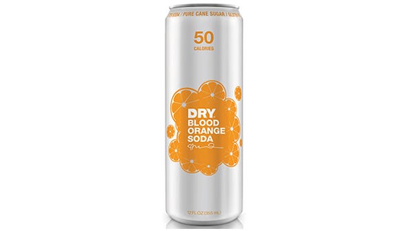
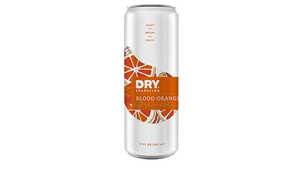
Dry Soda’s old packaging was clean, simple and effective. But the rebrand replaced the word “soda” with “sparkling”—eliminating the negative connotations of an ultra sugary beverage. Plus, the new packaging suggests a truly gourmet product.
Simple Mills
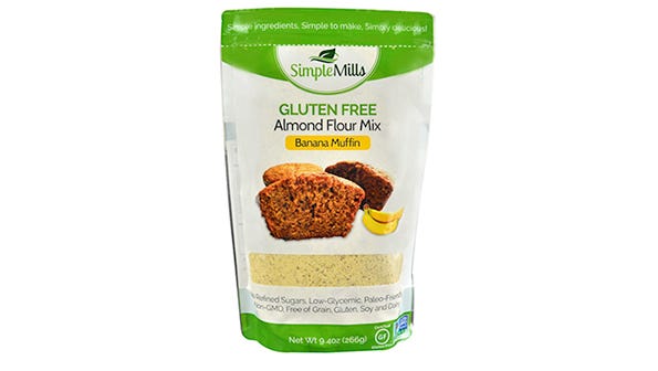
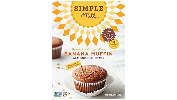
What a difference, huh? Simple Mills’ sunny packaging is bright and beautiful. Who wouldn’t want to take a bite out of that moist, gooey pastry? We also love how the product’s flavor is more prominent than “Almond Flour Mix”, as consumers have more of an emotional connection to words like “Vanilla Cake” and “Banana Muffin” than almond flour.
More bold redesigns
BaoBest Baobab Powder
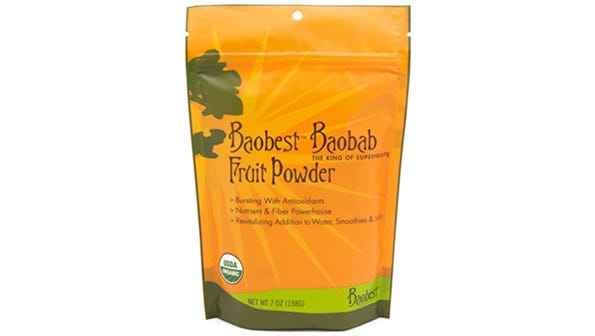
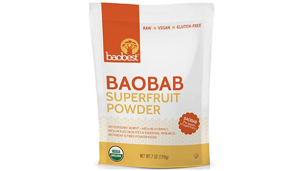
The original, bright orange packaging certainly pops on the shelf, but the strange font makes an already exotic ingredient seem unapproachable. The rebrand not only highlights baobab as a superfruit, but also it looks more like something you could easily add to a healthy smoothie. Kudos for including a silhouette of the baobab tree, too.
Arctic Zero Fit Frozen Dessert
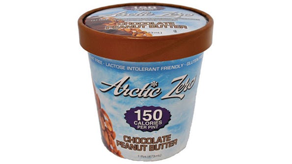
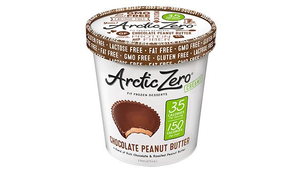
An infographic-inspired design and a white background opens up this pint of low-calorie fit frozen dessert, lending a light, airy feel. Plus, the prominent chocolate peanut butter cup focuses on flavor.
Temple Turmeric
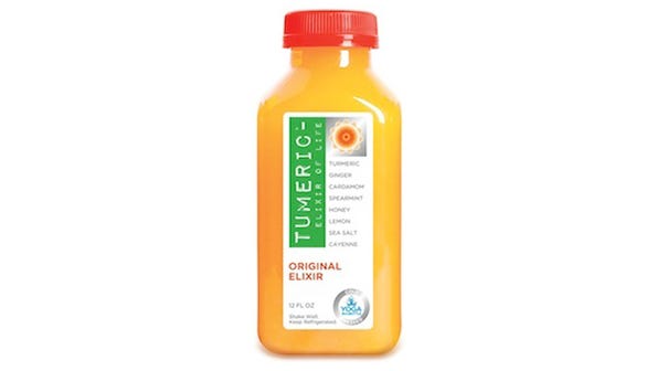
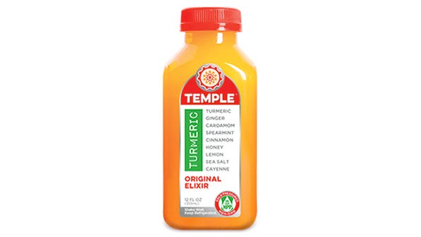
Aside from changing the spelling of "tumeric" to “turmeric”, Temple Turmeric highlights their mandala and pumps up the package colors. Every ingredient is still displayed on the front of package, which we love!
Rhythm Superfoods
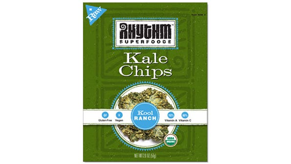
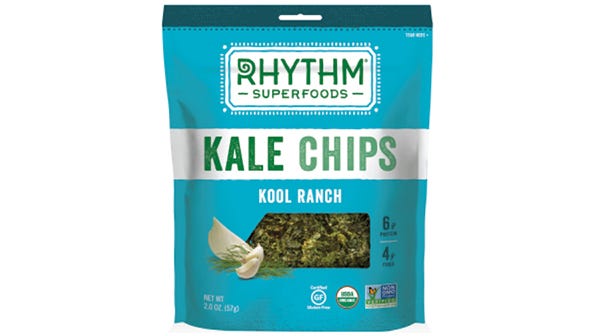
A bold new package design with big, san serif font and images of prominent flavor ingredients elevates kale chips from earth mama hippie food to chic and healthy sustenance. Also note that Rhythm removed “vegan” from the front of the package, eliminating the potential to scare away omnivore consumers.
Cabo Chips
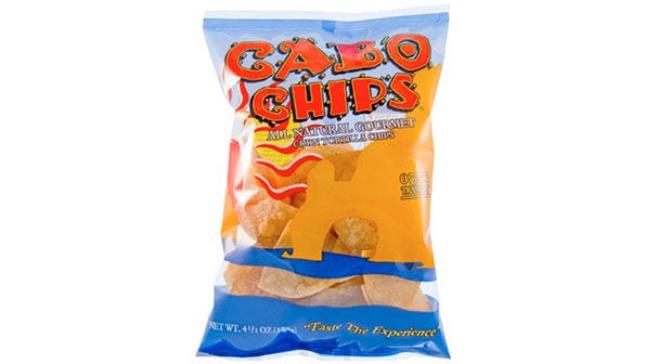
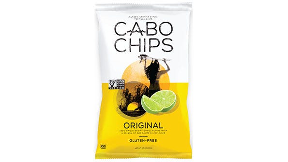
From busy, crazy packaging to elegant sophistication, Cabo Chips’ rebrand is analog to your vacation evolution: You can still go to Cabo, but the new packaging is now less college Spring Break and more yoga retreat.
About the Author
You May Also Like


