Packaging spotlight: 4 inspiring natural product rebrandsPackaging spotlight: 4 inspiring natural product rebrands
Provocative new package designs aptly communicate brand values.

A brand refresh can better attract grocery store shoppers at the shelf. But in the age of digital everything, it's equally important that package design entice online and social media consumers seeking new products that can serve their dietary needs and instigate excitement. The following package design updates are intended to mobilize consumers across all platforms to make purchases, spark loyalty and communicate brand values.
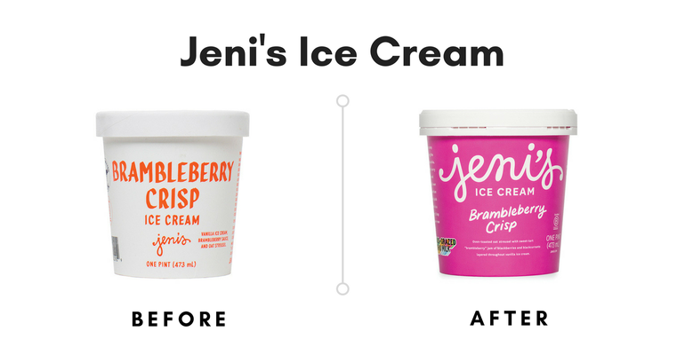
As Jeni’s expanded from scoop shops into grocery stores, the gourmet ice cream maker’s package design evolved to better serve retail shoppers. Enter the third iteration of Jeni’s pints, tinted with bright backgrounds that make the logo pop. When designing the new packaging, the branding team paid attention to how the pint would look in numerous areas—particularly on social media platforms such as Instagram. “We take into account how our pints look through glass—a freezer door, a lens, a screen,” says Jeni Britton Bauer, founder and chief creative officer of Jeni’s. “Everything we do, there is a barrier between you and the ice creams, and we designed our pints to cut through that. Creating color and emotion that way is important to us. That's how we build community now.”
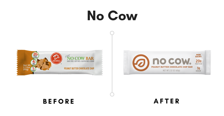
Built upon the premise that nutrition bars don't have to contain dairy, No Cow’s (formerly D's Naturals) new branding is unique because it focuses on what the bars don’t contain rather than what they do—a tactic that will certainly attract those who eschew dairy. No Cow’s logo—a simple leaf inside of a circle—indicates the plant protein sources inside, which include brown rice protein and pea protein. “By transitioning to No Cow, we’re signaling our brand evolution but are staying true to our mission of creating a true No Cow Revolution,” founder Daniel Katz said in a statement. “No Cow is no longer just a protein bar company; we are quickly becoming the trusted brand in all things dairy free, low sugar and high protein.”
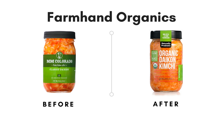
Formerly MM Local, this eight-year-old Colorado canning company recently went through a significant rebrand, changing nearly every aspect of the company marketing materials, including the name of the company, the logo and the packaging design. Thankfully, Farmhand Organics' classic preserved fruit and veggie recipes are staying the same. The transparent jar is a nod to the brand’s commitment to knowing exactly where its ingredients come from. (You can’t see it in this image, but the top of the cap indicates the farm that grew the produce inside each jar.) "A new name and new look allows our company to tell our story more directly as we grow distribution and work with more certified organic family farmers in the U.S.,” Farmhand Organics says.
It's a bold decision to alter the name of a well-known brand because core consumers could get confused at the store shelf. But the new design better tells the brand story.

Subtle branding updates for Essentia, a company that bottles ionized alkaline water, could have noteworthy payoff on store shelves. Here, the new box features more visible call-outs that better explain how Essentia differs from traditional bottled water. Notably, the three small plus signs in the old packaging have expanded to one large, plus sign in the center.
“The new packaging showcases Essentia’s bold, impactful and aspirational brand in an innovative and consumer-friendly design, bringing the brand personality to life and communicating what the brand stands for (the brand manifesto is highlighted on the new box design),” says Karyn Abrahamson, VP of marketing and brand innovation at Essentia. “This new packaging approach makes the product stand out at retail and makes the shopability for the consumer simplified and more engaging.” The consistent brand colors of white, red and black will help retain Essentia’s core shoppers.
About the Author
You May Also Like


