8 natural product packaging rebrands that rock
Beautiful natural industry packaging updates.
![8 natural product packaging rebrands that rock 8 natural product packaging rebrands that rock](https://eu-images.contentstack.com/v3/assets/blt09e5e63517a16184/blt2b78326ae87ad4d4/64ff1c6720b0a3339fd4d4d1/9_19.png?width=700&auto=webp&quality=80&disable=upscale)
Rice Honey’s differentiator was crafting regional honey blends designed to highlight the terroir of hives from around the country. But that message could have been better communicated to consumers seeking local honey. The new branding delivers a new name, Local Hive, and a new logo reminiscent of DIY aesthetics … the logo reminds us of a beautiful needlepoint.
Created by B.O.S.S. Food Co., these new bars feature bright, fun colors and cheeky illustrations that demonstrate the functional aspects of the product rather than the former's flavor-forward image. Large macronutrients such as protein and fiber content help consumers know exactly what’s inside.
How great is this bright, beautiful new packaging for Lavva, a plant-based yogurt brand that notably uses pili nuts—fat-rich nuts from Southeast Asia—to craft a craveable texture. We love how Lavva now features the chief ingredients inside the plant yogurt instead of the not-well-known pili nut. Modular cut-outs of vanilla beans and flowers remind us of wallpaper in a cool, mid-century modern house.
One of the few brands we know of to package yogurt in a glass container rather than a plastic one, Saint Benoit's label upgrade includes a kelly-green pop of color on the front of the package.
With chips masquerading as Boulder’s legendary Flatirons, this design pops thanks to the inclusion of white space on the front of the package.
A strong color block and four nutrition call-outs on the front of the package elevate Kate’s Real Food from a bar that seemed only for endurance athletes to a product that everyone can eat regardless if you’re sitting at a desk or sitting on a chairlift between ski runs. We love the sophisticated take on a mountain bike, too.
The CBD section of natural retail is exploding, and Bluebird is primed to lure in curious shoppers with bright new digs and streamlined messaging.
Larger protein and fiber call-out circles and a geometric package design (which reminds us of a sun) will take this chickpea snack from a once-in-a-while treat to everyday snacking.
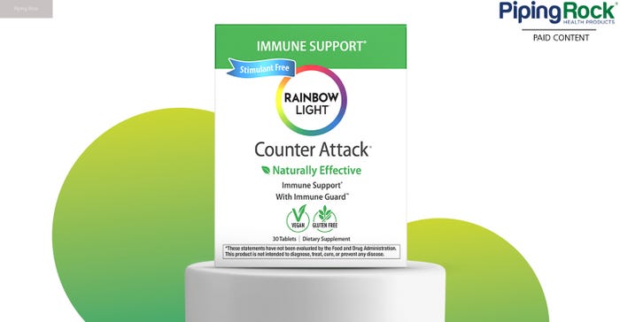
Check out the slew of natural brands that have updated their packaging design (or in one case, completely rebranded their entire company). A few notable packaging trends gleaned from this small sample of products include bright, blocky color and fewer words or ingredient call-outs to minimize clutter—all in the name of standing out on store shelves and developing a relationship with consumers.
Click through the slideshow to see these exciting rebrands.
About the Author(s)
You May Also Like