5 modern package design updates that work5 modern package design updates that work
These contemporary natural product redesigns are sure to impress core consumers—and attract new ones.

For way too long, natural products branding has prioritized earthy and green tones to signify the cleanliness of the ingredients inside. You know the type. Faux straw graphics. Delicate and dainty trees and leaves. Overly styled images of ingredients. Farm-porn imagery that rings a little hollow and fake. These five brands below recently updated their packaging—in ways both subtle and overt—that communicate the product inside is fun, clean and more delicious (and efficacious) than its conventional counterpart.
Natural consumers are now at a point where if a package is bright, they won't automatically conclude it's unhealthy. Rather, these bags, boxes and bottles show that natural is—or at least should be—hip, fashionable and something you like looking at in your pantry.
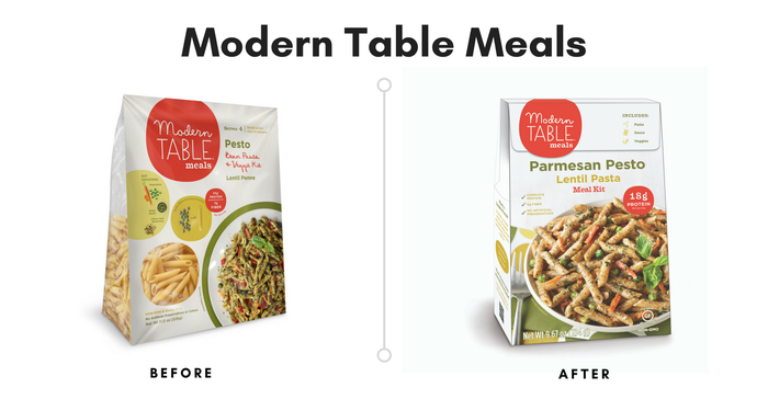
It’s one of the more subtle packaging tweaks we’ve seen, but it makes Modern Table Meals seem like a more polished and professional company. Gone is the transparent plastic hinting at the bean-based pasta inside. While clear paneling on product packaging has been successful for some brands (KIND Bar first comes to mind), most consumers already know what dried pasta looks like. Instead, Modern Table Meals improved the front-of-pack image of the finished dish, highlighting the meal’s texture and OMG-that-looks-so-good appeal. Strong construction and simple font highlights the quirky copy in the brand’s logo, strengthening brand recognition.
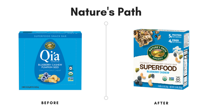
Nature’s Path named their original snack bars bars Qi’a, which came from the Chinese word “qi” meaning life energy, since these superfood bars deliver nutrition that helps fuel consumers through their day. Their new, bold packaging is successful because Nature’s Path highlights the superfood aspect of these bars—they’re packed with USDA Organic ingredients such as cashews, coconut, pumpkin seeds, chia seeds, wild blueberries and more. Rather than depicting a neat little pile of the ingredients, the new packaging indicates the bars’ explosion of flavor by artfully sprinkling them across the box.
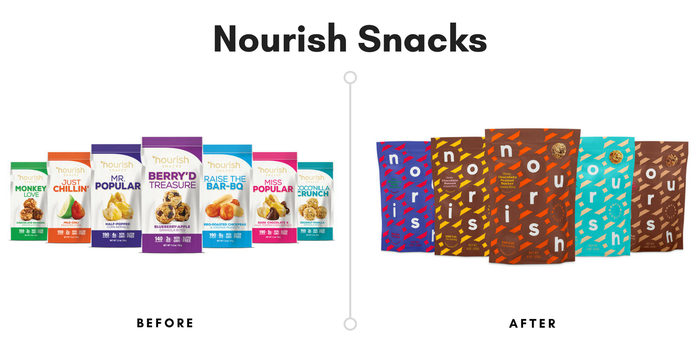
Nourish Snacks' old packaging? Stuffy, conventional and trying way too hard with those flavor names, like something you would find in the dusty corner of a gas station. The new packaging, however, wouldn’t look out of place in a modern art museum’s gift shop. Delightfully contemporary and chic, these oat clusters formulated by nutritionist Joy Bauer are primed to appeal to uber-hip snackers.
You can’t see it in this photo, but the cheeky copywriting on the back of the package is adorable and engaging. For example, “There are books about the benefits of blueberries & apples. But books taste bad. Our blueberry-apple granola bites are another story.” It’s totally our imagination, but the oat clusters just seem to taste better, too.
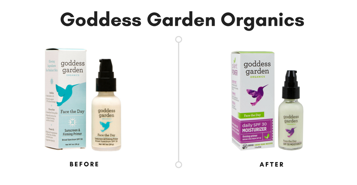
A vibrant color switch from cool to warm tones makes a big difference for this natural personal care brand. The changes are subtle: Stronger messaging around SPF level (it’s written twice). A NSF certification seal on the front of the package. Look closely and you’ll see that ingredient highlights on the side of the box simply say “plant power” rather than the former box’s “glowing ingredients for radiant skin.”
According to the company, Goddess Garden’s “luxurious soft finish on the boxes… forms the appropriate expectation of the high-quality organic products inside.” We couldn’t agree more.
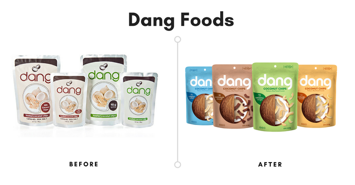
Dang Foods rapidly rose as a whole-food snack brand with its cream-colored packaging. It stood out on store snack shelves that typically contained neon-wrapped junk food. It certainly made a statement, and the word “dang” resonated with shoppers—as in "Dang! That's Good!". The new packaging marks the evolution of Dang Foods from a small, niche brand with one line into a super-cool snacking force. Bright colors appeal to both natural and conventional consumers, and the fun, graphic coconut on the front is a whimsical way to tell shoppers exactly what’s inside. A soft, matte finishing on the package makes these coconut chips (and the brand’s totally delicious rice chips) just as nice to hold as they are to eat.
About the Author
You May Also Like


